Mystic Mike’s predictions: What does 2026 hold for paid media?
By Mike Sharp, Operations Director at Launch That time of year is here. The time when I confidently predict the…

By Josh Marinaro
Forms are often one of the most important parts of your website – whether it’s for the checkout, submitting an enquiry or a resource download. Despite this, forms are often overlooked, rarely getting any optimisation at all.
If you’re reading this and now feeling a little bit hot under the collar about the forms on your website, then this is your lucky day. We’ve compiled a list of five (fairly) ways to fix up your forms.
Let’s ease in with a nice straightforward one.
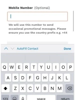
When building a form, you’ll have the option to provide a user with a few keyboard layouts for when they’re viewing on mobile. These are Email, Phone, Number and Text. It will amaze you how often the incorrect layout is implemented. And yet, this is something really simple.

In the example below, we can see a website using the text keyboard when the user is asked to fill in a mobile number:

Of course the user can switch it themselves, but it’s irritating – and not many users love filling in forms as it is. So be sure to check this one out on your own website across email, text and number fields as it could be a really quick win for you.
No-one likes an error message, but just like death, taxes and Ed Sheeran, sometimes they’re going to be unavoidable.
So, how can we make these less frustrating for users? Again, it’s pretty simple: Be nice.
Despite it sounding obvious, there’s research behind it. CRO Expert and Form Guru Craig Sullivan ran a study looking at 40 participants using a website form and found that by putting in ‘nicer’ error messages, the average score of the form raised from 4.7 to 6.5 out of 10.
To add to this, back in 2013, UX Movement put together a list of key terms to avoid in error messages – and while 2013 is a lifetime ago in the digital world, it’s very relevant:
If you can see any of these in your forms, consider swapping them out and replacing them with more reassuring and helpful messaging, pointing out what the user needs to do to rectify the error, rather than just telling them they’re wrong – nobody likes hearing the latter!
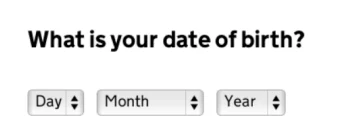
Many forms require the user to fill in their date of birth. Strange as it sounds, there actually is a right and wrong way to ask the user this information.
As standard, a number of websites will have a dropdown menu like the one below. You’ve probably seen it before. Looks fine, right?

Wrong. You can make it much easier!
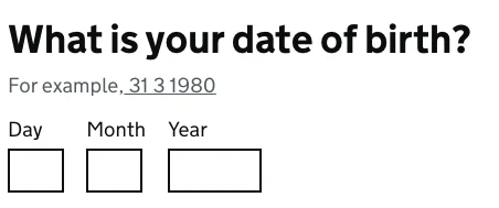
The dropdown takes users roughly 12-16 taps to get to where they need to be, as well as several annoying scrolls. It also becomes a longer process the older you get, which no-one wants reminding of.
The method used on GOV.UK allows for simple number inputs, which actually takes far less taps (9-11), is a lot faster, is way more mobile friendly and isn’t more laborious just because you’re ageing. Much better.

Potentially one of the more tedious parts of filling in a form is your address. Most of us prefer an address lookup, which saves us a lot of typing.
Referring back to CRO expert Craig Sullivan, he suggests that high converting websites always have address lookup and he’s seen anywhere between a 5% and 30% increase in conversion rate from implementing it.
Do make sure it’s reliable though. If a user can’t find their address, you won’t get the sale or lead! Luckily, there are a few simple platforms that can help with integrating address lookup into your forms such as Google Maps (which is free!) or Loqate, to name just a few.
Okay, this one is a little more techie and perhaps isn’t assuper simple as the others – but we’ve saved the best until last.
Is there anything more frustrating than submitting a form and getting an error message, but you have absolutely no idea what’s triggered it?
If, like me, your answer to that question is a resounding no, there is a good chance you’ll like inline validation.
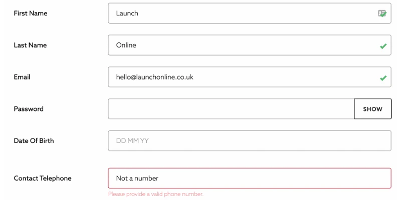
Inline validation is the process of telling the user when they’ve done something right (or wrong) as they go. If there are any issues along the way, the user is informed and can take immediate action. That eliminates the possibility of that post-submit form rage – or worse, total abandonment and a lost lead or sale.
The below from retail giant Next is a great example of inline validation in practice:

As you can see, we’re given a lovely green tick where fields are filled in correctly. Where there’s an error, the box turns red and the user is provided with a clear instruction to minimise frustration.
You’ll be surprised at the impact that a fix like this has, and how much weight it gives to the overall user experience.
Forms are vitally important to securing conversions, so they should be one of the first places you review and optimise. Try not to set it and forget it – user behaviours do change over time so keep up with the latest best practices, and be sure to study your own data to see where you can make improvements.
If you need a set of objective eyes, we offer a conversion rate optimisation service too – find out more.

By Mike Sharp, Operations Director at Launch That time of year is here. The time when I confidently predict the…

Exclusive insights from Meta's Manchester summit on how you can work with your agency to nail Black Friday/Cyber Monday and…

Launch has been selected to join Google's International Growth Program to help new and existing clients expand their reach.

Are you using a tailored approach to your Youtube ads? Here's what you should be doing and how to make…

By Darcy Cooke, Senior Measurement Analyst TLDR: Common GA4 Mistakes Holding You Back Stop treating GA4 like a basic reporting…

It’s time to get your calendar out and plan your marketing events for the year ahead so you can schmooze…

Is Google dead? It’s a question we get asked all the time. With ChatGPT, Perplexity, and Gemini grabbing headlines, you’d be forgiven for…